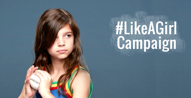
The Always ‘#LIKEAGIRL’ commercials promote Always products in the name of feminism. These videos seek to answer the question “Do we limit girls?” by asking girls if they feel inhibited as females. The girls range in age from around 5-15, and every single participant answers with a definitive “Yes.” Yes, they have all been told that as girls they cannot accomplish as much as men. The advertisers, after making valid points about the injustice of stereotypes and sexism reaching small children, take care to promote their products: “Always wants girls to be confident.” Always gives the girls the opportunity to write their inhibitions on boxes and then knock them over. Always is tearing down gender barriers by allowing girls to feel empowered.
Audience
Although this campaign first premiered their ads during the Super Bowl, where humans of all ages, shapes, genders, and mindsets would be watching, their target audience is clearly girls.
Purpose
Though men could watch these ads and seek to aid in making women feel as equals, these ads are to make girls aware of the existing inequalities and that they should ignore the stereotypes in the interest of being individuals.
Context
Because this ad was premiered during the Super Bowl, it means that fathers would have been watching with their daughters. In the midst of muscular men tackling each other on television, a lesson about women as equality is taught.
Author
Although the company Always is the one who is simply promoting their products by using cute little girls to rope the audience in, they impart an important message at the same time. They seek to say that they do not simply care about the money but also the well-being of their customers, and that each customer know her worth.
Genre
While these videos and campaign site clearly fall under the genre of an ad, due to the promotion of products, I believe it could also be classified as a political statement. The more society realizes the potential of women, the less patriarchal values will continue to reign.
Emphasis
Upon analyzing the website for this campaign, the words that seem emphasized the most are the brand name, Always, and then subsequently ‘girl’ and ‘battle.’ While the brand stands out, the advertisers want customers to know that Always is joining in the battle for building girls’ confidence.
Contrast
With regards to contrast, there isn’t as much that stands out. The videos take center stage on the web page while any text is noticed second. The titles of their sections of text are in black whereas the text itself is in blue and thus stands out more.
Organization
When scrolling down the page, one first sees the videos, then more information, followed by links to social media. All the way at the bottom certain products are listed with prices, for those who feel so inclined to make purchases after seeing what Always is about. The menu bar at the top provides for easier access to extra information, and the entire site is filled with pictures of girls, thus promoting the hashtag #LIKEAGIRL.
Alignment
The primary video is followed by text directly under it, for those who do not care to watch the video but still desire the information. The ‘learn more’ boxes are symmetrically arranged four at a time with catchy phrases for titles.
Proximity
With the logo at the top, Always effectively uses placement and proximity to advertise their products and message. This brand's ad is refreshing in its original use of girl power to sell products for girls.
 RSS Feed
